Here are some important guidelines for using the Thunderkick logo. For any questions, please contact: marketing@www.thunderkick.com
Logos
Variants
Main logo. Should be used in most situations. Available in white or black.
Horizontal
On rare occations when the name in the main logo gets too small compared to other company logos in lists for example, the horizontal logo could be used instead to make sure our name is properly visible.
Horizontal logo available in white or black.
Logos
small logo
For small sizes/containers
In very small sizes for print or screen there is a special logo that should be used to make sure our name is more readable.
Main logo should use small versions in sizes from:
Print: 27mm – 15mm height
Screen: 80px – 42px height
Horizontal logo should use small version in sizes from:
Print: 5mm – 3mm height
Screen: 20px – 15 px height
Logos
margins
Make our logo stand out
Use empty space around the logo to make it stand out. Don’t put information too close to the logo as it will get lost in the visual information.
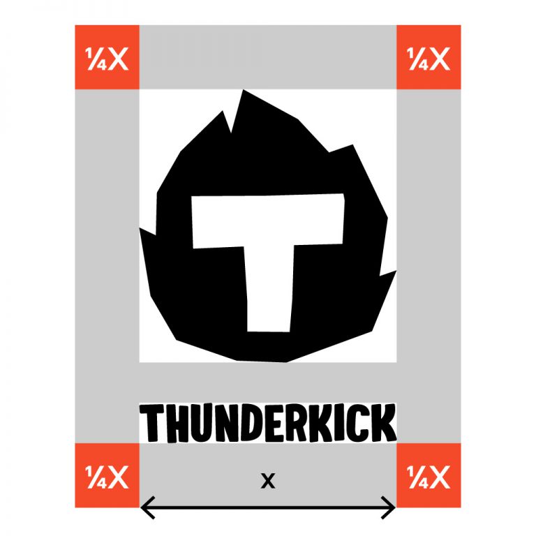
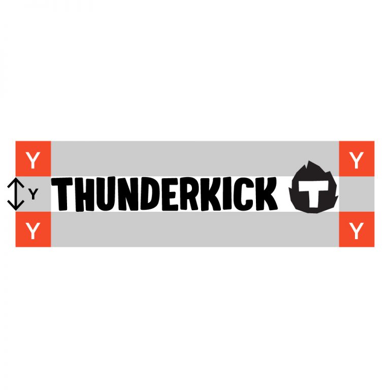
This is how you calculate proper margins. These margins are the minimum amount of empty space required.
Logos
avoid
Avoid
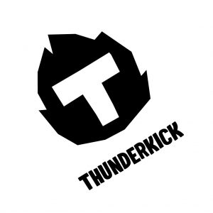
Don’t rotate the logo
Don’t squeeze logo in any direction

Don’t change details within the logo
Don’t write our name in another font
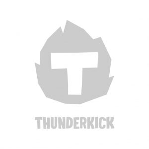
Don’t use weak/delicate contrast
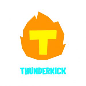
Don’t mix different colors within the logo
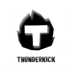
Don’t use bevels or decorations
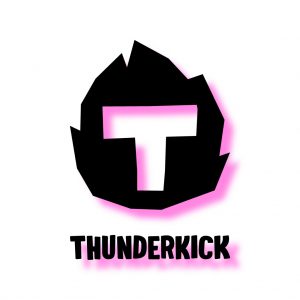
Don’t use drop shadows
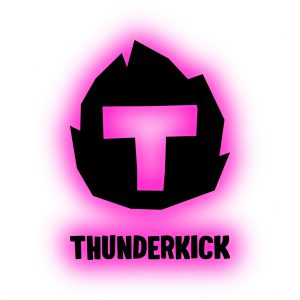
Don’t use glow or outlines.
Welcome to Thunderkick!
Please confirm that you are 18 or older before entering this site.
By continuing to browse our website you agree to our Privacy policy.